
Top 12 design systems
Here is a dozen examples of what you can do with a design system in your organisation.
A design system maintains the visual and functional elements of your organisation in one place, in order to fulfill your brand principles through the design, realisation, and development of products and services. It may include a sketch library, style guide, pattern library, organisation principles, best practices, templates, codes, and more.
There are many thoughts and ideas about design systems out there, and nearly as many iterations. To help you navigate the design system waters more easily, we have gathered a list of 12 examples, which can serve to inspire you in your own endeavours.
So, in no special order, here are 12 of the world’s top design systems:
Polaris by Shopify
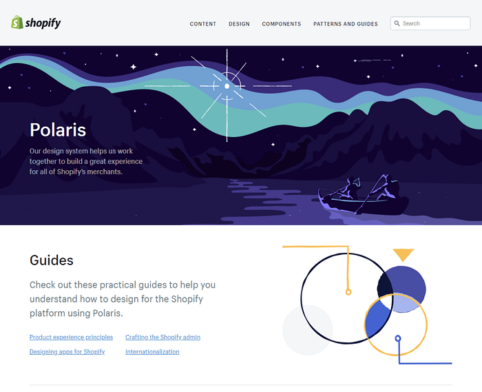
Shopify is a Canadian e-commerce company with a namesake proprietary platform for online stores and retail point-of-sale systems. The company is also behind a design system called Polaris, aimed at helping both Shopify and the Shopify merchants building better user experiences.
In addition to having sections for design, components, and patterns, Polaris also offers a section for content, with guidelines for tone of voice, grammar, and copywriting tips.
Material Design by Google

First introduced as a design language by Google in 2014, Material Design has since evolved into an adaptable system of guidelines, components, and tools that support the best practices of user interface design. Material Design is based on open-source code, facilitates collaboration between designers and developers, and helps teams quickly build products.
Atlassian Design
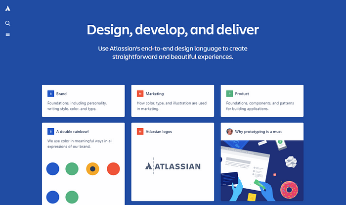
Atlassian is an Australian enterprise software company, best known for the issue tracking application Jira and its team collaboration tool and wiki Confluence. Atlassian also sports a design system, first released as the Atlassian Design Guidelines (ADG) in 2012.
The system is very detailed and is composed of design patterns, code components, and a library of UI assets in Sketch. You can also find the reasoning behind each choice made.
See also: Hybrid or headless — where to go?
IBM Design Language
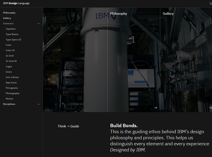
IBM’s design system might not be as flashy or stylish as others, but it’s rather sleek, functional, and straight-to-point, which serves just as well. Several examples of use with their design system is present, together with a logical and neat overview of animations, iconography, colours, reusable code, and more.
Airbnb Design

Airbnb not only offers affordable hospitality services around the globe. The company also shares insights about their own design system, featuring cutting edge techniques.
Airbnb Design consists of components that are “like elements of a living organism,” where a set of properties defines each component, with its own personality and function. A component can work with others or evolve on its own, while still being a part of a larger, evolving ecosystem.
Fluent by Microsoft
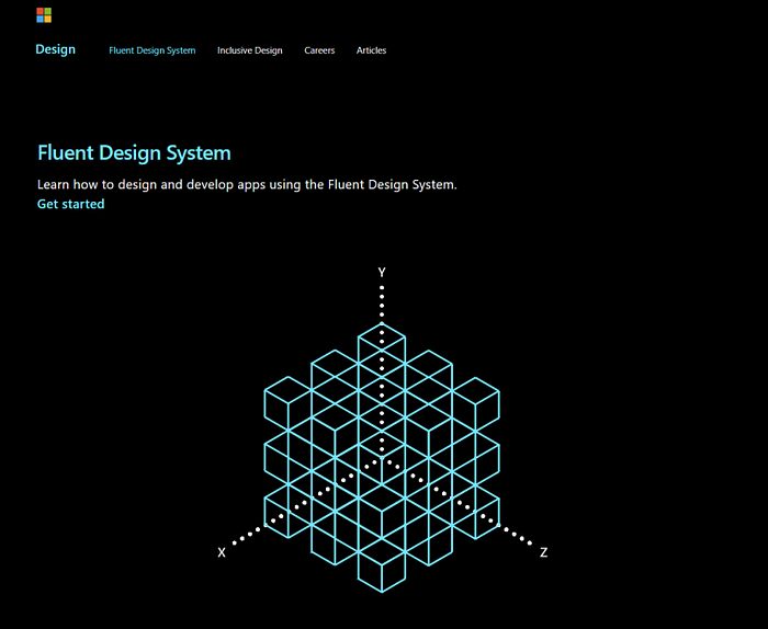
The Fluent Design System was developed by Microsoft in 2017 and includes guidelines for the designs and interactions used within software designed for all Windows 10 devices and platforms.
The sensory elements are based on five key components: light, depth, motion, material, and scale, with the increasing intent to be applied beyond flat screens.
See also: How rich web front-ends can boost your customer journey “
MailChimp
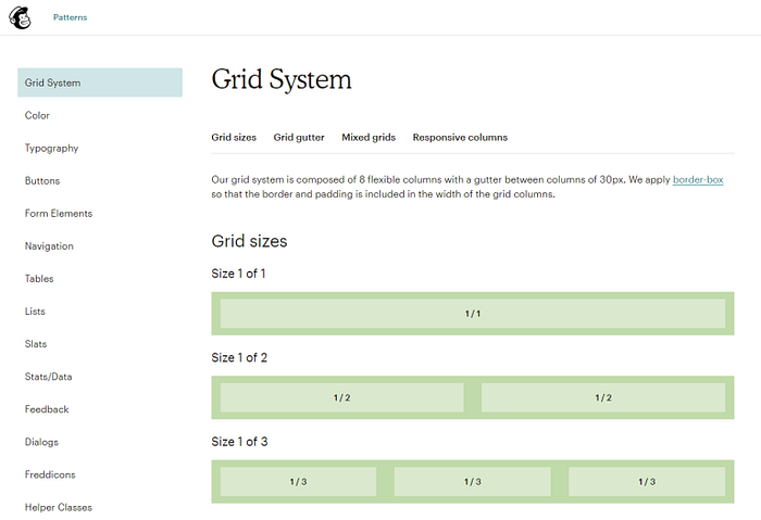
Email and marketing automation service MailChimp features a well-established design system, being available years before design systems sprouted fully. The design system is robust and keeps it simple and user-friendly.
MailChimp also has a handy content style guide available.
Nachos by Trello
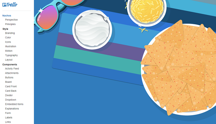
The project management application Trello has a design system with a neat and lightweight approach, simple to browse, and with principles that are easy to follow. The stated principles involve styles and components, and help identifying what is in line with the Trello tone of voice and what is not.
Solid by BuzzFeed

The American Internet media, news, and entertainment company BuzzFeed is known for its brazen and playful style, and their design system Solid is no exception. Solid is full of confidence, but is still concise and works as a useful reference for BuzzFeed’s CSS.
Don’t miss: 3 ways to get in on digital transformation “
Buffer

Buffer offers a platform for managing social media, and the company also offers insights into their design system principles. The Buffer Style Guide is based on the notion of atomic design, where the main idea is that independent parts (atoms) can be combined into larger structures (molecules), which in turn can be combined into even larger structures (organisms). A nifty idea, ensuring consistency, clarity, and simplicity when scaling your organisation.
Apple
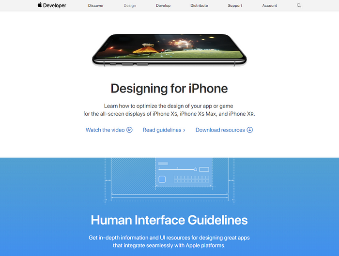
Similar to Microsoft’s Fluent, Apple’s design system is meant to enhance the experience of the suite of Apple products and services. In this design system, you can watch video sessions and tutorials for building user-friendly and future-proof experiences, as well as how to optimise the experiences for iPhone X-e.g. designing for sound and writing for push notifications.
Lightning by Salesforce
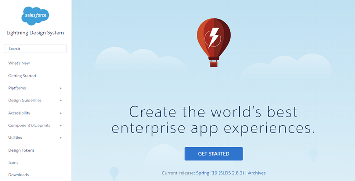
Salesforce is a behemoth within cloud-based software, including CRM, customer service, marketing automation, analytics, and application development. The American company sports a thorough and well-documented design system called Lightning, which is an open-source project focused on building business apps. The design system provides a professional and comprehensive guide to accessibility, components, patterns, utilities, design tokens, and more.
***
Creating and maintaining a design system is certainly no short-term project or a bed of roses, but all the effort you will put into it will eventually pay off in the terms of reusable codes and elements in any organisation that scales.

Originally published at https://enonic.com on March 25, 2019.
